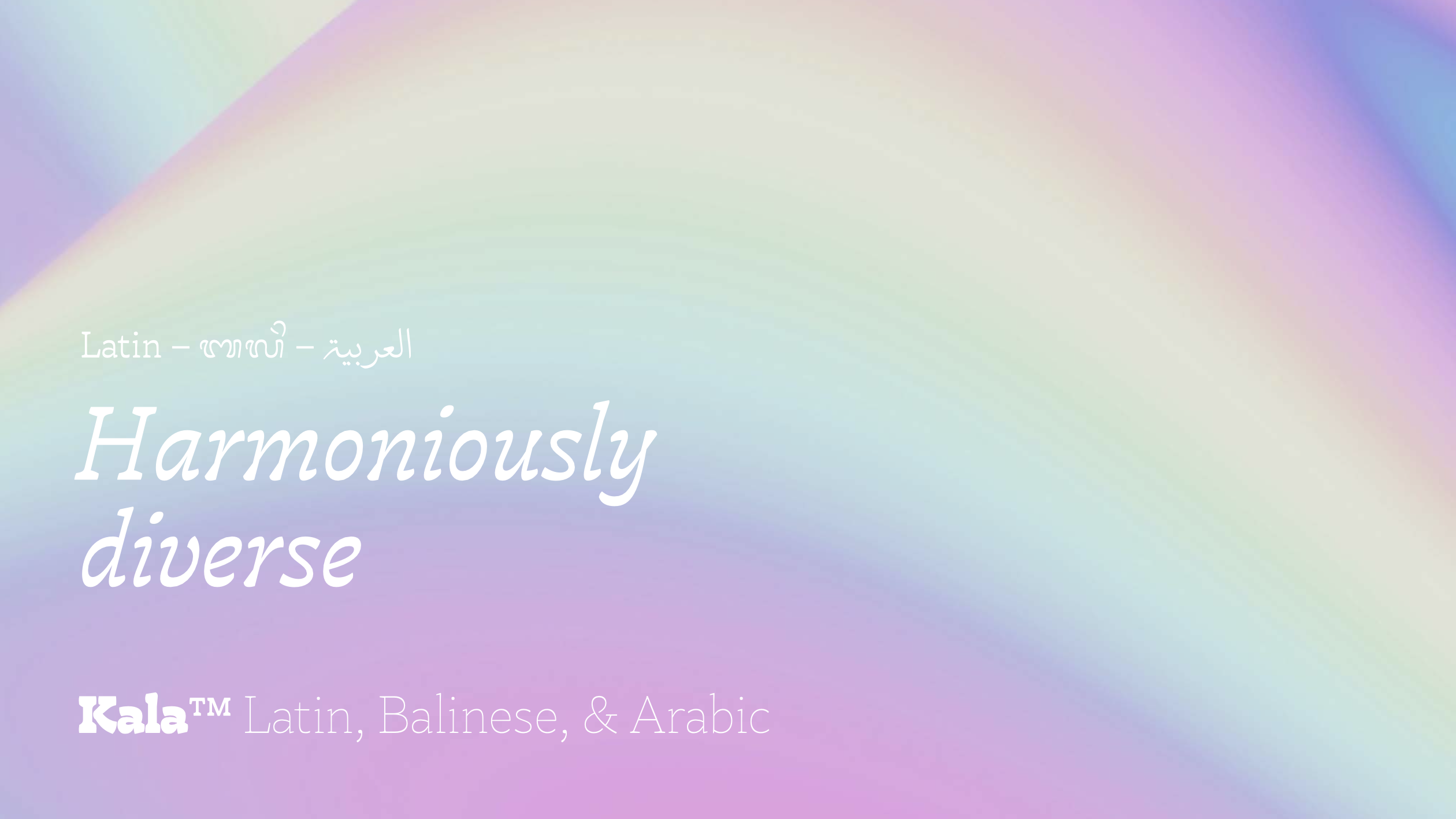
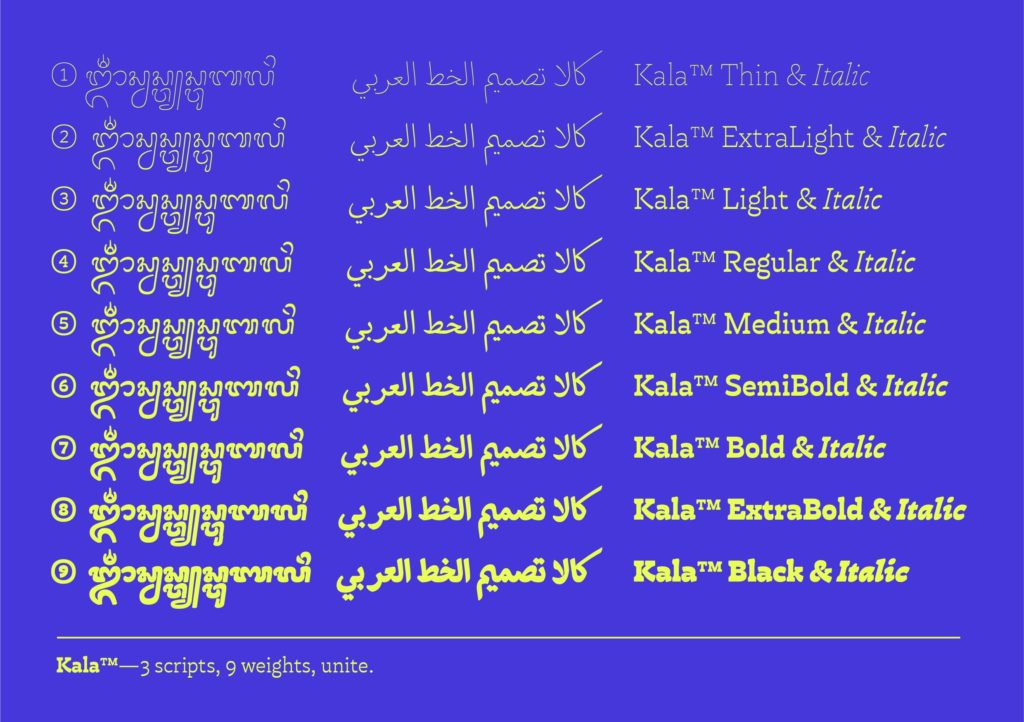
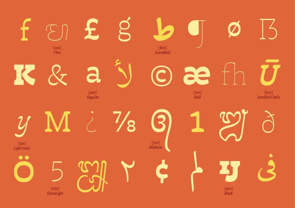
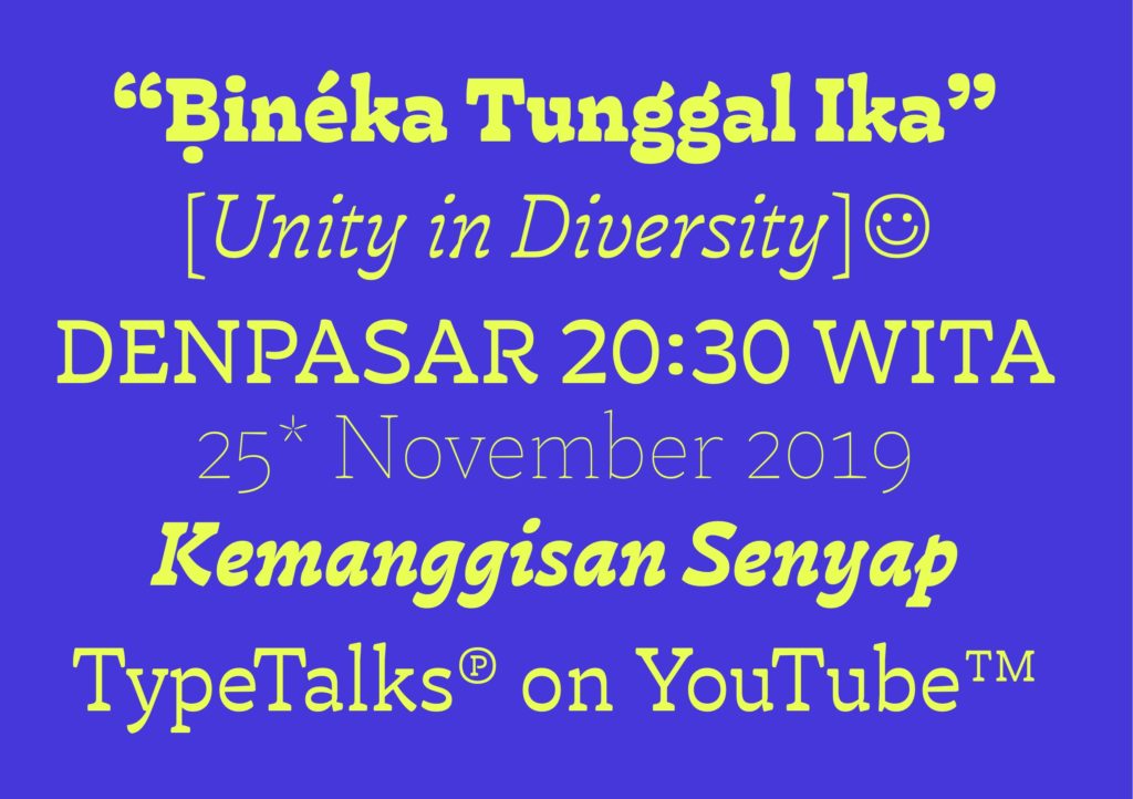
Meet Kala™, a friendly multiscript typeface with horizontal contrast. Supporting 3 scripts in 9 weights, the family embraces the diversity of scripts while at the same time unites them as a family.
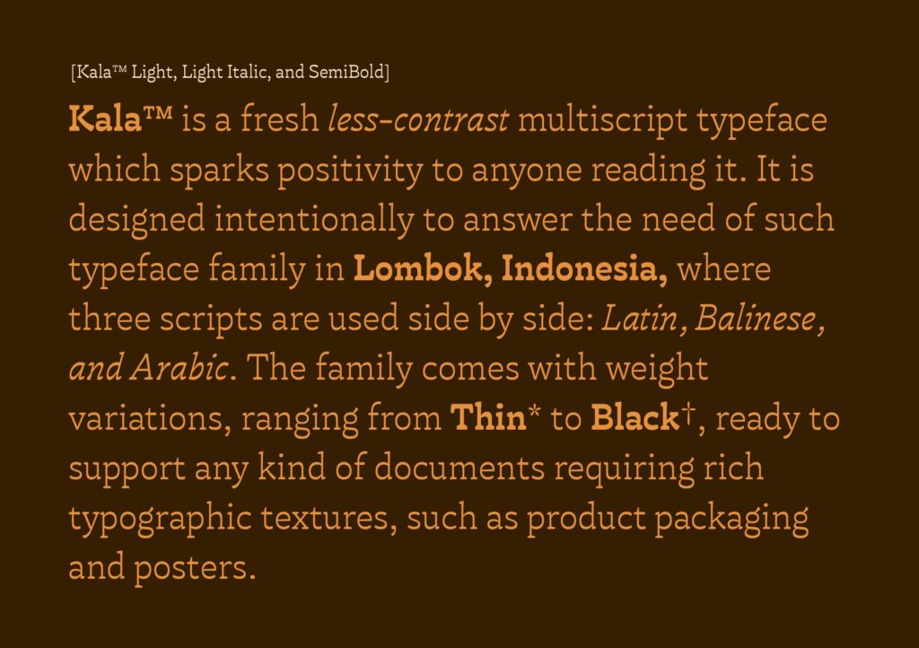
Developed as a project during the MA Typeface Design at Reading, it is initially designed to answer the need of such type family in Lombok, Indonesia, where three scripts are used side by side: Latin, Balinese, and Arabic. With curvy cuts, the family looks playful and fresh. Coming with a wide range of weight variations from Thin to Black, the family is ready to support any documents requiring rich typographic textures.
In Lombok, an island on the southeast of Bali, Balinese and Arabic script are used alongside Latin. While a few typeface families are already available to support the needs of the language, there are still gaps of problems have not been solved:
(1) most of Balinese typeface family is currently only available in a single weight, lacking typographic textures that are often needed in complex documents.
(2) Other than Noto project by Google, there is no single family encompassing Latin, Balinese, and Arabic altogether, making it more challenging to put them harmoniously side by side.
Additionally, most of the available options are considered too formal to put in a playful way such as in product packaging, restaurant’s menus, and posters.
This project aims to offer a solution to that gap. Kala covers 3 scripts in 9 weights ranging from thin to black, wide enough to support any document requiring rich typographic textures.
Adopting Balinese into digital platforms has been particularly challenging, not only for type designers but also for UI/UX designers. The script is unique as it conventionally requires generous vertical spacing — which is often unaccommodated in Latin-dominated digital platforms. I presented key insights from this study at the 2023 Face/Interface conference at Stanford University. You can watch the presentation here.
